Back when games were just pixels and sprites, video game art was crucial in developing and showcasing the nuances of the characters and world in conjunction with game play.
When graphics weren’t capable of fully rendering and realizing the scope of the developer’s imagination, it was through pen and paper that they expounded on their creations.
The game play may have been a form of escapism but it was the concept pieces and box art that sold the fantasy.The two were intertwined, like bubbled words accompanying pictures in comic strips.
Over time, the art became less about telling a complete story and more of a behind the scenes look. Eventually, they were treated as profoundly as any Renaissance masterpiece, albeit with more reverence thanks to their accessibility.
The video game artists were to modern day audience as Da Vinci and Rembrandt were to the people of their times. The art showed how talented the team was and afforded a glimpse behind the creative process.

These days though, technology has caught up and in some ways, surpassed what could be put on paper.
Details, details
Box art – having always had the dubious job of capturing attention – is now aided by expensive marketing stunts, attractive graphics and tried and true game play expectations.
While it still has to be attractive enough to grab the attention of the public, less stress is placed on it to perform.
And art has always been influenced by the ever changing societal landscape. Gone (mostly) is the need to feature loud caricatures of muscled and oiled bandanna wearing men with ripped off sleeves and wielding a massive gun in each hand on the cover.
Now, the design is less loud but more evocative.
Freed from having to sell the idea, concept and content totally, box art has evolved into its own brand of art meets marketing.
With less broad strokes and storytelling needed to fit within the rectangle case, box art is free to be its own thing.

You still get the masculine or feminine figure wielding weapons and taking shots at an unseen enemy but the art has largely moved on from that being a template.
As minimalism becomes the de facto design philosophy of this generation, we will see some of its principles in the art.
However, artists and developers have yet to embrace it fully, opting instead to stick with the tried and true formula.
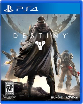
The upcoming Destiny box is one such example.
It is one that had the opportunity to be something really powerful and unique by playing on the theme of mystery and intrigue, instead it goes with the generic armored archetypes posing with weapons before the massive Traveler.
The mystery benefactor of the human race – a large mystery tied to the tapestry of the game – is criminally downplayed.
Of course, the final box art could be changed before the game is released but as it stands now, it is disappointing. For now though, it could have alluded to the mysteries of the world without actually showing the world, but it chose to do none of that.
One thing to remember is; in the ‘less is more’ design prerogative, less is infinitely more powerful when embraced fully and done right.
Minimal damage

However, in many cases, the box art have very little to do with the game and although minimalism is used, it’s not properly utilized.
The excellent but ill-fated Kingdoms of Amalur: Reckoning was one such game.
Granted, it was going to be a challenge to properly convey the theme and mood of the game through a singular piece of art work but the resulted choice in a generic male warrior archetype on the cover contradicts the sheer volume of options the game actually supports.
There are also surprisingly games, while not as expansive as Kingdoms of Amalur, that prefer to use shock-like art to convey the mood.
For example, Dead Space. What has a dirty, armored and bloodied hand, half hidden in shadow have to do with anything related to the story?
Absolutely nothing. There was no shock value, no emotions or feelings rattled. It was another generic and uninspired presentation.

Even the cover of Dead Space 3 has the lead, faceless character wielding his signature weapon in a relaxed pose against a white backdrop.
It does nothing for the feel of the game.
Presumably, it was trying to evoke minimalism but did little more than have a titular ‘warrior’ on the front to fulfill conventional stereotypes while saving time, effort and money on actual presentation.
Ironically, a piece of fan art has managed to capture the moody oppressive sense of loneliness in Dead Space far better than the official one.
Here it shows Isaac Clarke surrounded by the great dark beyond of space. It gives one the impression that not only is he alone but completely surrounded by an air of hopelessness.
Not every game benefits from something minimalist however. The Halo games had box art that showed off Master Chief in full badassery but given the context of the game, it worked.
Halo is an FPS after all.
Ultimately though, box art is subjective. Not everybody pays attention to it and as mentioned, it is hardly necessary these days to sell copies when the marketing machine behind the game is fueled by millions of dollars.
Advertising, selling of beta access (a paradigm shift for the worst), commercials, trailers, conventions; these and far more make or break the sales of a game. Box art is hardly worth a closer look by many companies save the most meticulous ones, like Bungie and to an extent, Blizzard.
Fortunately for those who do enjoy art is its simpler form, beautiful and evocative covers are not dead by a long shot. Rare, but not dead.
What games do you think have some of the best box art? Sound off below.
More minimalist game posters can be found here


